


How to Read Candlestick Charts: A Beginner’s Guide
Candlestick charts are one of the most powerful tools in trading. Whether you’re looking at stocks, crypto, or forex, these charts reveal price movements in a way that’s both simple and detailed. If you’ve ever opened a trading platform and felt overwhelmed by all the green and red bars, don’t worry. Once you understand the basics of candlestick charts, they’ll become your go-to tool for making smarter trading decisions.
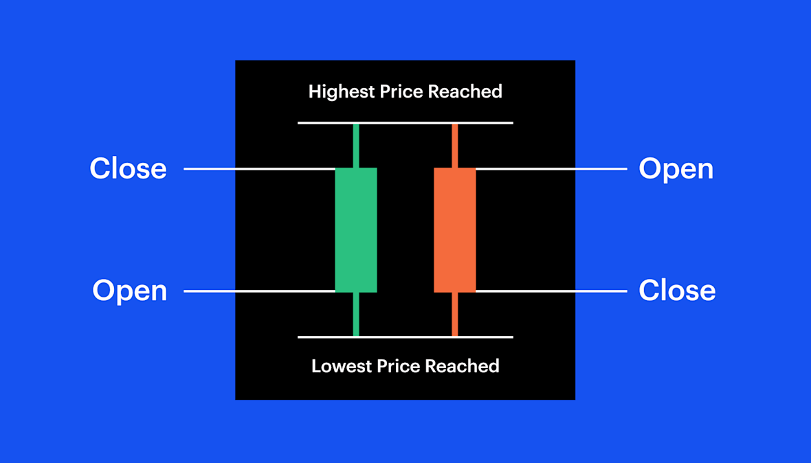
What Is a Candlestick Chart?

A candlestick chart is a type of financial chart used to show the price movement of an asset over time. Each “candlestick” represents price data for a specific time frame—this could be one minute, an hour, a day, or even a month.
Each candlestick tells you four key things:
- Open: the price when the time period started.
- Close: the price when the time period ended.
- High: the highest price during the time period.
- Low: the lowest price during the time period.
The body of the candle shows the difference between the open and close prices. The thin lines above and below the body (called wicks or shadows) show the highs and lows.
How to Read Candlestick Colors
Colors matter. A candlestick chart usually uses two contrasting colors—commonly green and red.
- Green (or white): The closing price was higher than the opening price. This means the price went up.
- Red (or black): The closing price was lower than the opening price. This means the price went down.
The longer the body of the candle, the stronger the buying or selling pressure. A short candle suggests little price movement.
Key Candlestick Patterns

Traders don’t just look at single candles—they study patterns. Here are some of the most common ones:
1. Doji
A doji forms when the opening and closing prices are almost the same. It looks like a cross or plus sign. This signals indecision in the market and can mean a reversal is coming.
2. Hammer
A hammer has a small body at the top and a long lower wick. It usually appears after a downtrend and signals that buyers are starting to gain control.
3. Shooting Star
The opposite of a hammer, a shooting star has a small body at the bottom and a long upper wick. It often appears after an uptrend, signaling potential bearish reversal.
4. Engulfing Pattern
- Bullish engulfing: A green candle completely covers the previous red candle, suggesting strong upward momentum.
- Bearish engulfing: A red candle completely covers the previous green candle, suggesting downward momentum.
5. Morning Star and Evening Star
- Morning star: A three-candle pattern that suggests a bullish reversal after a downtrend.
- Evening star: The bearish opposite, signaling a potential reversal after an uptrend.
Tips for Reading Candlestick Charts
- Look at the context: A single candle doesn’t tell the whole story. Always check the bigger trend.
- Use support and resistance levels: Candlestick patterns become more reliable when they form near key price levels.
- Combine with other tools: Indicators like moving averages, RSI, or volume data can confirm what the candles suggest.
- Watch the timeframe: A pattern on the 1-minute chart isn’t as strong as the same pattern on the daily chart.
Why Candlestick Charts Matter
Candlestick charts give traders insight into market psychology. They don’t just show price—they show the battle between buyers and sellers. By learning to read them, you gain a clearer view of momentum, potential reversals, and the strength behind price moves.
Whether you’re a beginner or a seasoned trader, candlestick charts are worth mastering. They’re not magic, but when combined with other strategies, they can significantly improve your decision-making.
Final Thoughts
Learning how to read candlestick charts is like learning the language of the market. At first, the shapes and patterns may seem confusing. But with practice, they start to reveal stories about supply, demand, and trader behavior. Start with the basics, practice spotting patterns, and always trade with discipline.
No comments yet
Be the first to share your thoughts!